This section will cover:
- Introduction
- Understanding the ‘Customise’ Graph Menu
- Select a Type of Graph
- Graph By
- Options
- Understanding Graph View
- Seeing More Information
- Hiding Values
- Editing the Axis Titles
- Troubleshooting: Data too Big to be Visualised
- Downloading your Graph
- Knowledge Check
Introduction
The learning objectives for this page are:
- How to visualise the data on your table in a graph/chart format
- How to customise your graph/chart
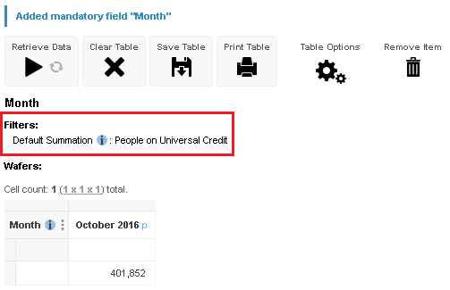
Now that we understand more about Table View; to better visualise the data in your bespoke data, Graph View can be a very useful and powerful tool.
To use Graph View
- Open the table that you would like to view in Graph View. For more information on how to do this, please visit All About Tables
- Once in your currently open table, In the top left-hand side of the page, click once on the ‘Graph View’ option.
- You should be directed to a page similar to the screenshot below:
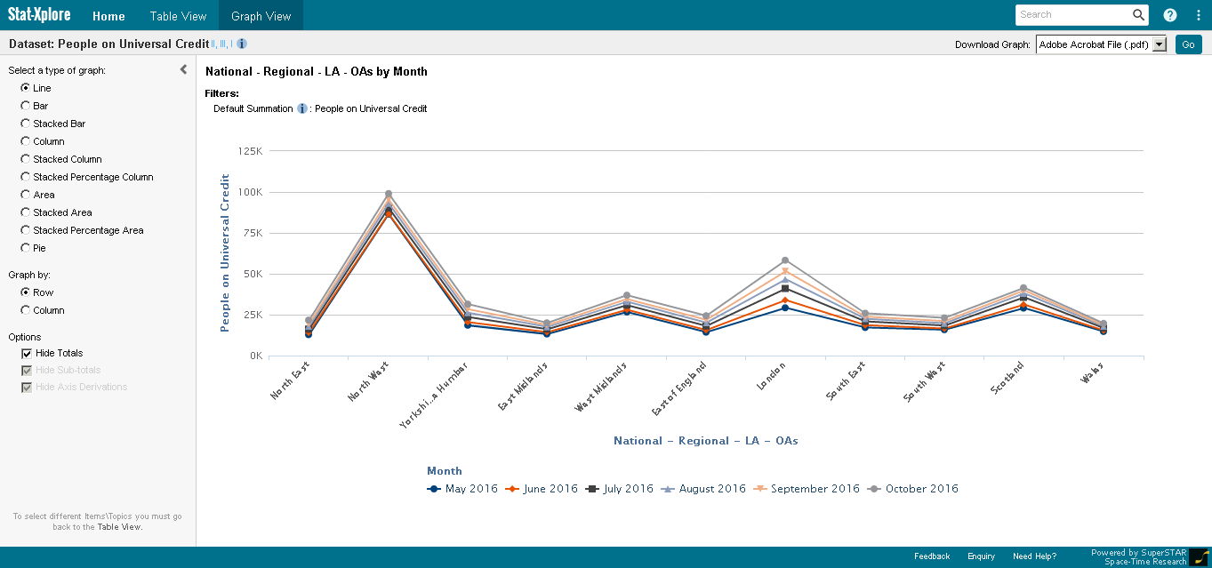
In this screenshot,
- The section on the left-hand side shows a list of options that you can use to fully customise your table to the table. .
- For more information, please scroll to the subsection ‘Understanding the ‘Customise Graph Menu’ below.
- The area on the right-hand side is where your graph is displayed. Within this area you can better visualise the data that may be harder to comprehend in Table View.
Additionally, please note that if your table is currently set to use percentages, then the graph will also represent the values as percentages.
Understand the 'Customise Graph' Menu
Select a Type of Graph
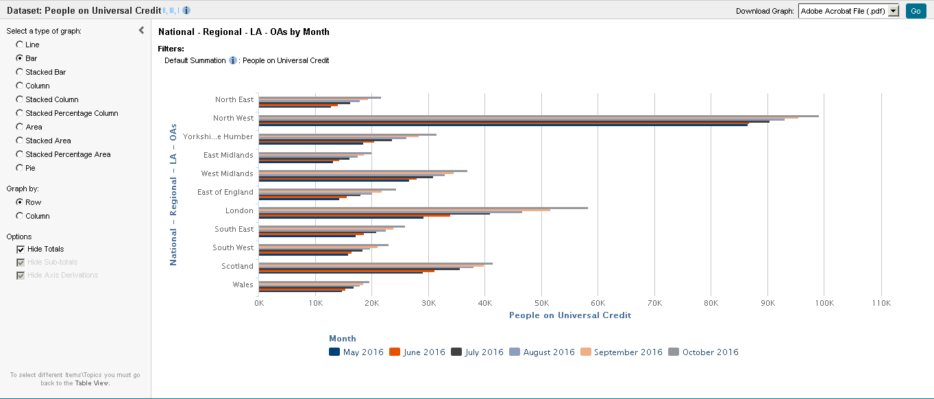
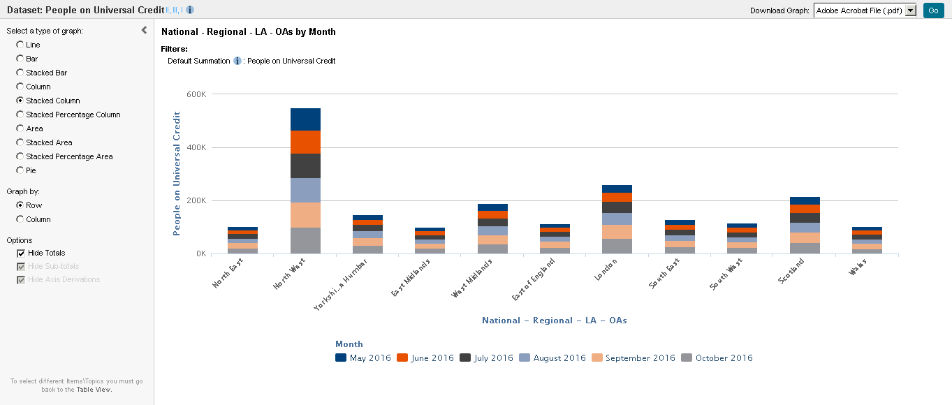
Within the menu, the ‘Select a Type of Graph’ option allows you to change which type of graph your table can be visualised in the ‘Customise Graph’ section. The graph will change automatically.
For example, the screenshots below show examples of bar charts and stacked column charts respectively.
Depending on the type of data, different graphs may suit it better. We recommend that for
- Line graph: Time series, Correlation
- Bar Graph/ Stacked Bar Graph: Distribution, Ranking, Deviation, Magnitude
- Column Graph/ Stacked Column Graph/ Stacked Percentage Column: Ranking, Deviation, Magnitude
- Area Graph/ Stacked Area Graph/ Stacked Percentage Area Graph: Time series
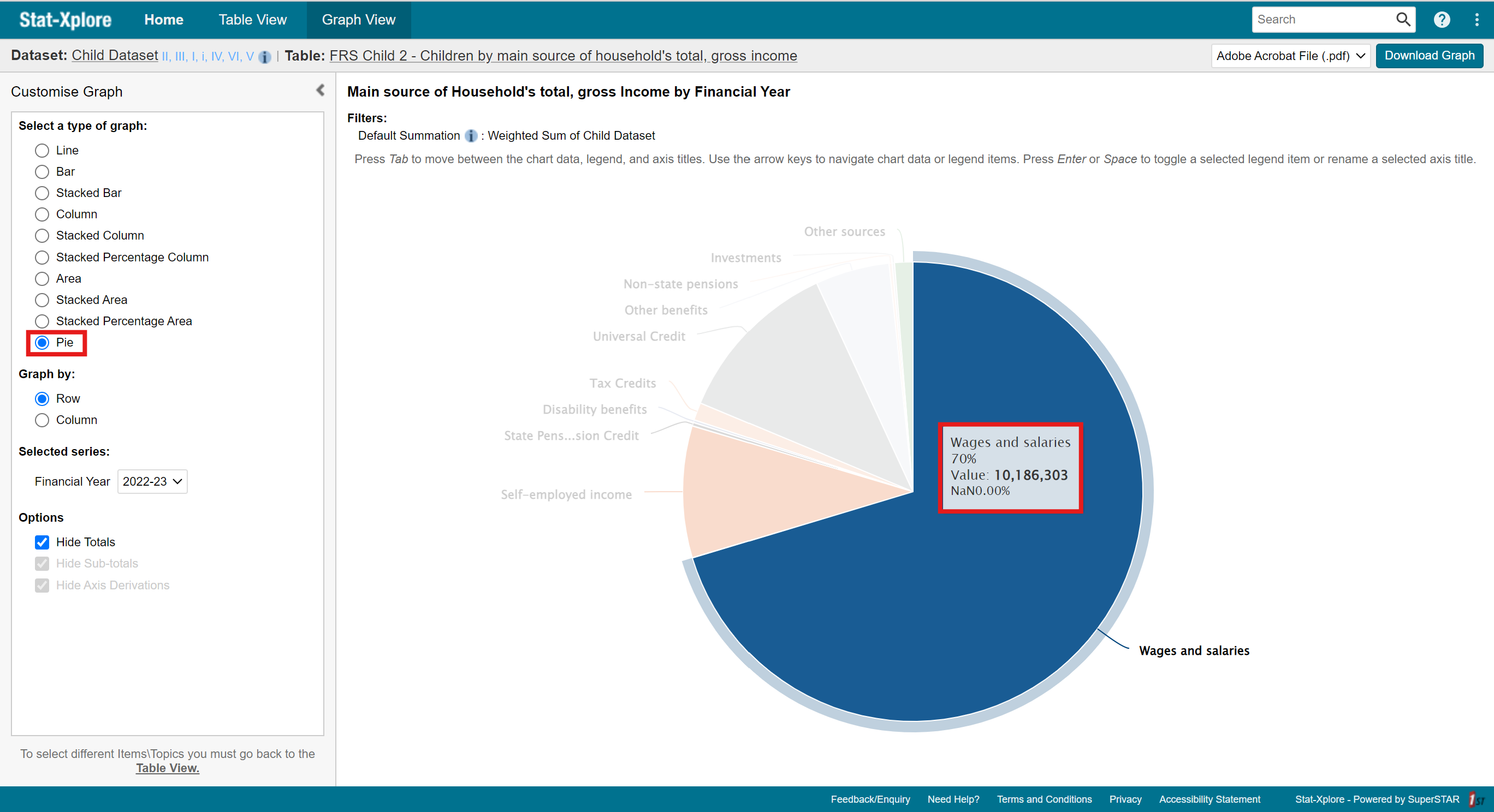
- Pie Graph: Part-to-Whole
For more information, please visit ONS website.
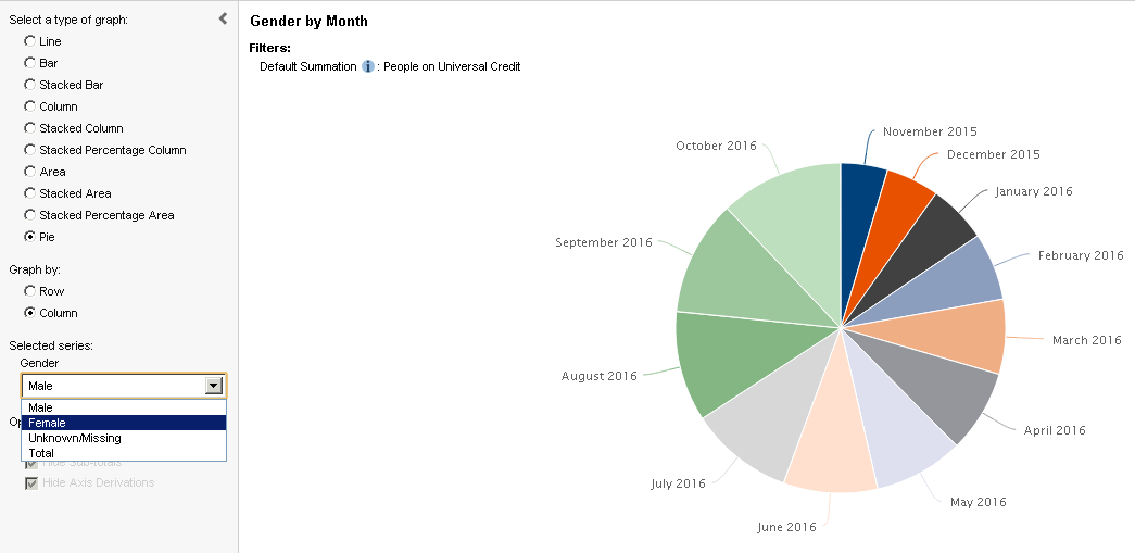
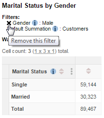
Additionally, please note that pie charts can only show a single row or column at a time. To change this,
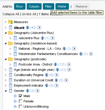
- In the ‘Customise Graph’ menu on the left-hand side of the page, under the ‘Graph by’ option, choose whether you want to show a row or column.
- Stat-Xplore will then pop up an option called ‘Selected Series’ where you can then select the specific field you want to show.
Graph By
Within the ‘Customise Graph’ menu, the ‘Graph By’ option allows you to organise the format in which the data in your table is presented in your graph.
By default, Stat-Xplore places the items from the table rows along one axis and shows the values from the table on the other axis. However, this sometimes causes the graph you have created to look unusual and not what you expected to see.
For example,
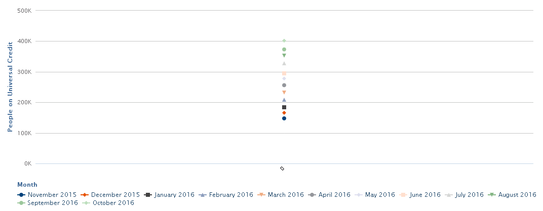
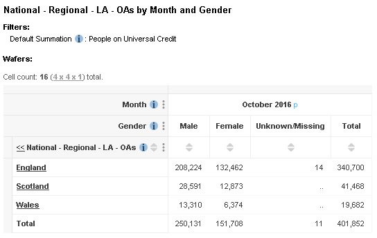
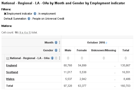
- The following table shows the number of Universal Credit claimants in each month for the 12 months starting October 2015 with all months positioned in the column of the table:
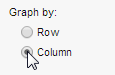
- However, this can be hard to visualise and understand the data and its trends. Thus, if you want to view the column headings on the axis instead, you can use the ‘Graph by’ option to swap. Simply click ‘Column’ from the ‘Graph By option’ as seen below:
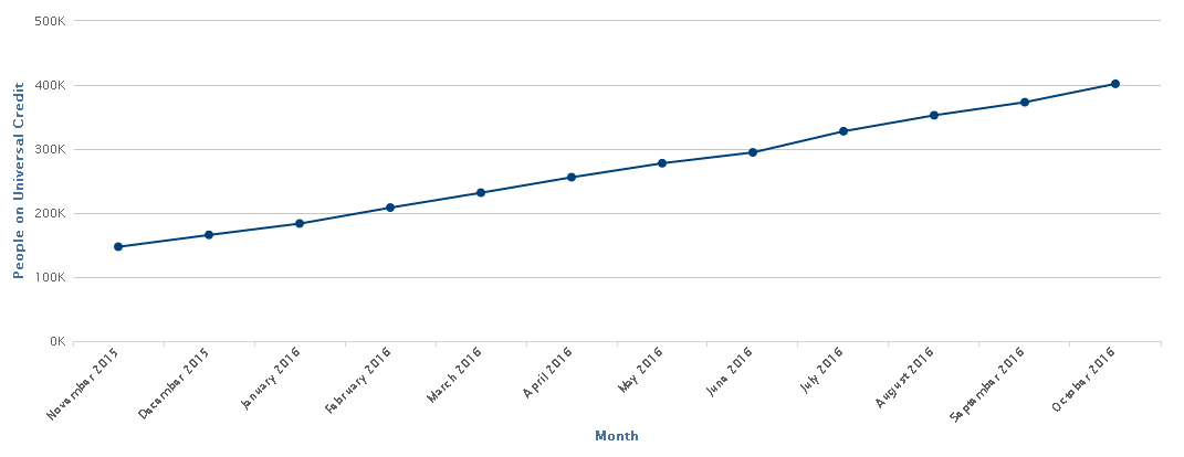
- Stat-Xplore will then displays the column headings on the x axis, which gives a more sensible looking chart for this dataset:

When using this data in Graph View, this displays the following chart by default:
Options
In the ‘Options’ section of the ‘Customise Graph’ menu, you can click on the check boxes below to either show or hide totals, sub-totals and axis derivations in the graph:
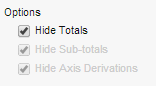
Please not that all these options are selected by default. If your currently open table does not contain totals, sub-totals, or axis derivations respectively, the corresponding options will be greyed out.
Understanding Graph View
Seeing More Information
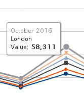
Graph View is an excellent tool to visualise data and understand its trends and the wider picture. It is also excellent at viewing specific values in the graph.
To do so,
- Move your mouse over the graph and hover over the value you would like to see.
- Stat-Xplore will then show a tool tip containing more information about that value in the graph:
Hiding Values
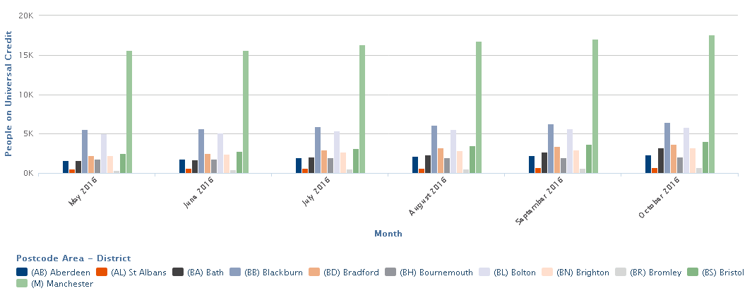
Another interactive aspect of Graph View is the key located at the bottom of the screen.
By simply clicking on any of the keys, you can temporarily hide them from the graph. This can be particularly useful if you have some outlying value that makes it hard to focus on what you are interested in.
For example,
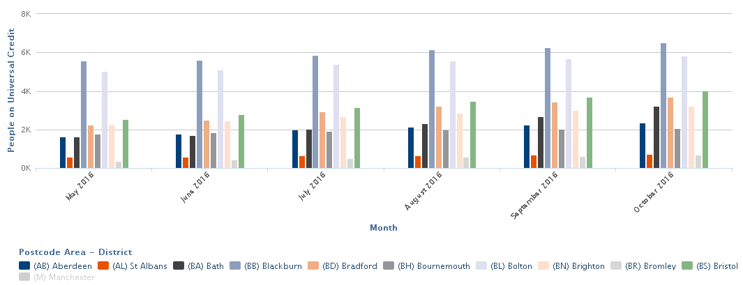
- In the screenshot below, the number of Universal Credit claimants in the (M) Manchester Postcode area is so much higher than the others that it is hard to see the differences between the other Postcode areas.
- To temporarily hide from the graph, you can click (M) Manchester in the key. The graph automatically updates to hide this value and the scale of the y axis automatically adjusts to make best use of the available screen space.
Editing the Axis Titles
Though Stat-Xplore does automatically give you titles both axes, you able to customise this. To do so, simply click once on one of the axis titles and enter your new title (or clear the box to revert to the default title)
Your edited titles will be displayed for as long as you remain in ‘Graph View’ and will be included on PDF or PNG downloads. You can change the graph type and the graph will keep the same edited titles. However, the titles will not be saved if you switch to one of the other views. For example, if you switch to ‘Table View’ and then switch back to ‘Graph View’, the graph will revert to the default titles.
Troubleshooting: Data too Big to be Visualised
If your table has too many items, you may not be able to generate a graph. In response, Stat-Xplore will display a message indicating that your data is too big to be visualised:

To resolve this, go back to Table View and make changes to your table to reduce its size. You might be able to reduce the table size by applying the zero suppression options.
Downloading your Graph
Unfortunately, you cannot save your graph inside Stat-Xplore as it is only available for the current session. However, if you save the table that you used to create the graph, you will be able to re-open the saved table and then access the graph again via Graph View.
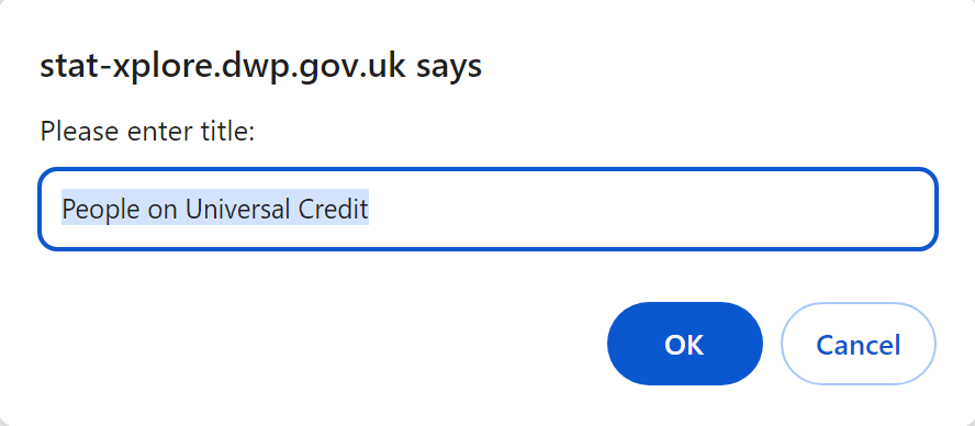
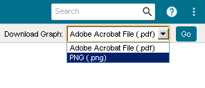
Alternatively, if you want a copy of the graph (for example to use in a report or presentation) then you can download your graph. To do so,
- Within ‘Graph View’, select the download format from the drop-down list located in the top right-hand corner. You can either choose to download the graph as a PDF or in PNG (image) format:
- Click Go.
Further Questions
If you still have any questions that are not answered in the guide, please feel free to email Stat.Xplore@dwp.gov.uk
Check your Knowledge!
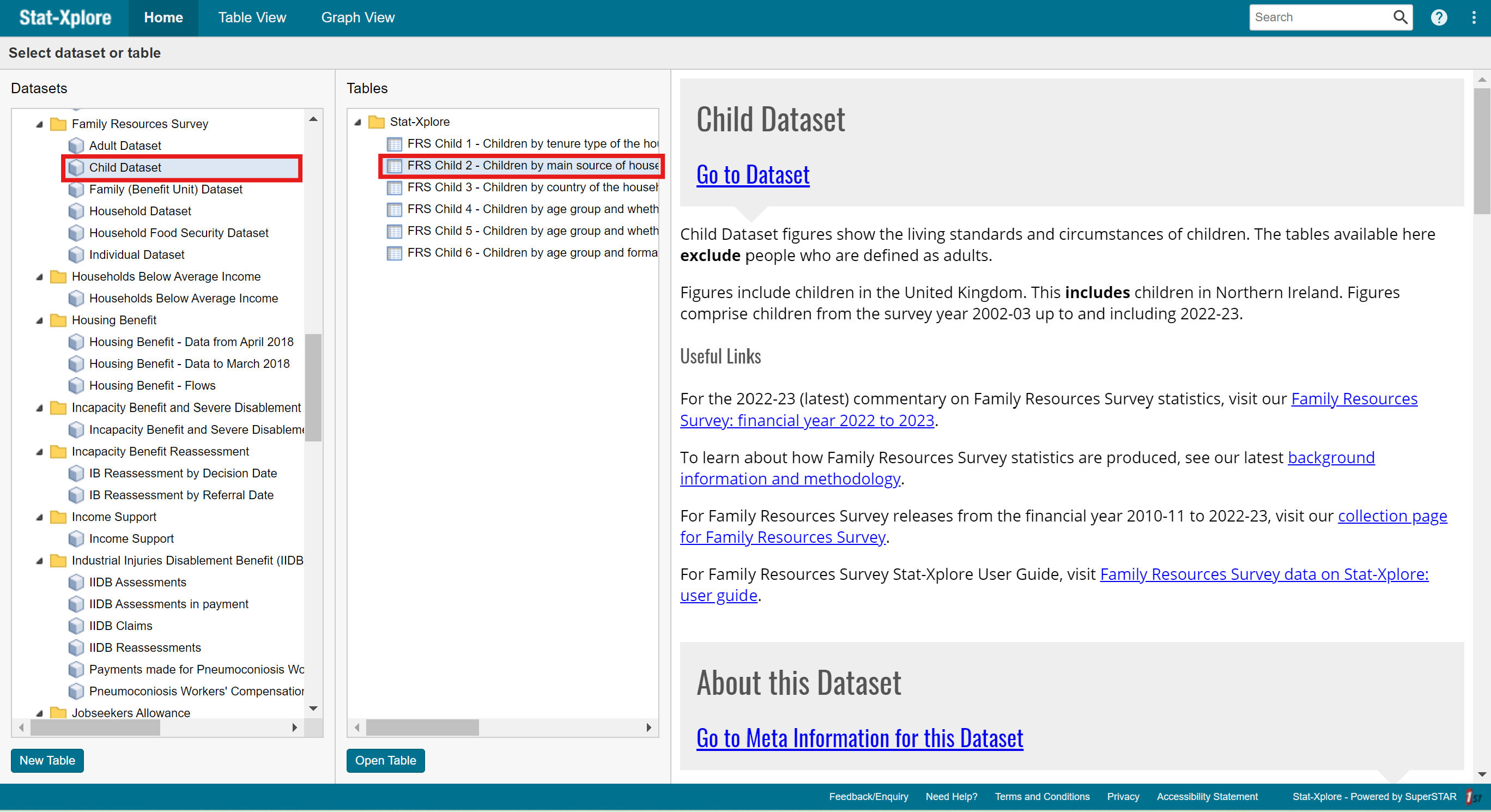
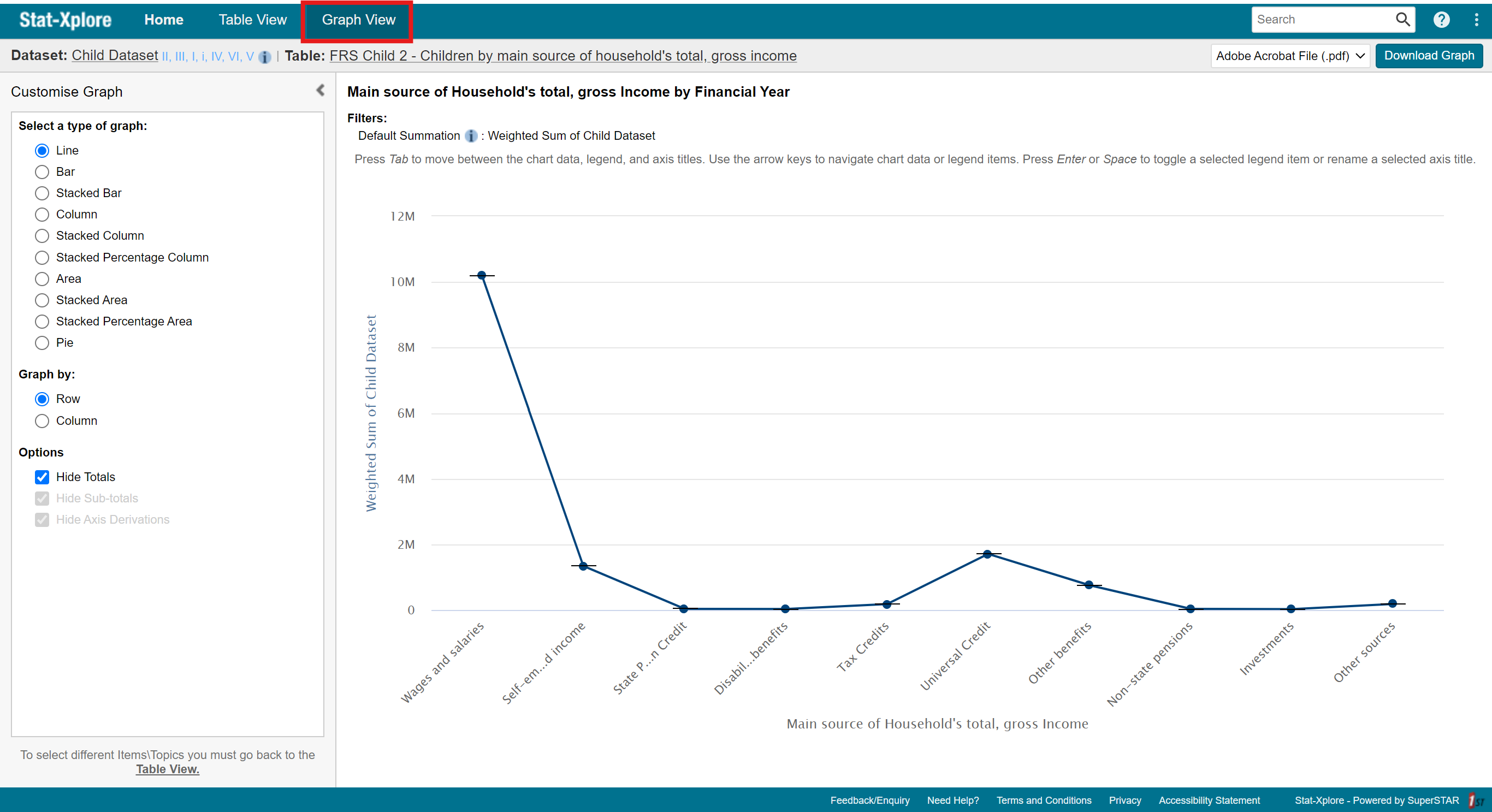
⦁ Navigate to the dataset ‘Family Resources Survey’, the data cube ‘Child Dataset’, and the table ‘FRS Child 2 – Children by main source of household’s total, gross income’. From this table, go into ‘Graph View’ and convert the data into a pie graph. What is the percentage of households that have ‘Wages and Salaries’ as its main household income?
